Adding some Richness
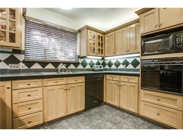
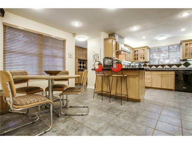
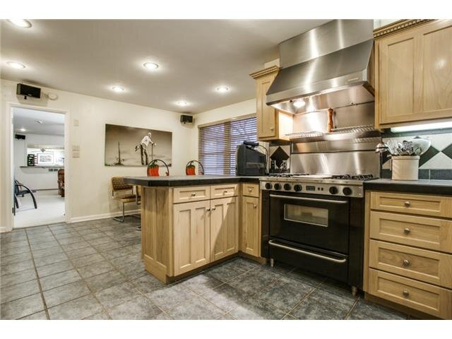
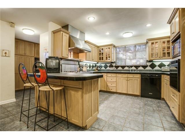
When we moved into our house about 4.5 years ago it needed so much work! It had really great bones but reeked of cigarette smoke and the layout was very weird. We focused all of our budget and attention into making the house workable for our family while keeping in mind there would definitely be creative changes in the future. We updated the look of the kitchen by painting the cabinets white, taking them to the ceiling and updating the counters and backsplash.
Fast forward to this year and the cabinet paint needed a big ‘ol touch-up job. Since there was going to be a lot of painting in our future I thought we might as well have a change too! I loved the light and bright white feeling but lately I’ve been craving something moodier and bolder. After visiting India this year my eyes were so HAPPY with all the saturated color. I started looking at color charts, images of colorful rooms and settled on a ruby color, but more specifically the way a ruby stone looks in the shade. So obviously super easy to find…. right? Wrong! I ordered every color option available and none were quite right, so I played with layering different colors together until I landed on the right hue.
The hubs and I divided and conquered. I took the job of painting the boxes of the cabinets inside and he took on the task of spraying the doors outside. We’ve done enough projects over the years together to know it’s better if we are both in charge of our own jobs and also forgiving of any of each other’s inevitable mistakes. We are not professional painters by any stretch but I’m happy with how it all turned out!
Of course, when it comes down to it the color change spawns a need to change other things. The first thing on my hit list was the cabinet hardware. The knobs were a bar shape and for some reason they were ALWAYS crooked (and by some reason I mean my kids would spin them!). Then of course the light fixture above the sink seemed so basic so I figured why not change that also! It’s a slippery slope around here guys. The new hardware is black so it blends in with the cabinet color and of course it’s just a simple round knob to avoid my past issues. On the glass accent doors I felt like switching it up! I found these really special leather and brass knobs in a natural blush finish on Etsy and they are incredible! I actually stumbled on this leather strap and glass light fixture while I was sourcing for another project and it stopped me IN MY TRACKS. I was excited to have two leather elements in the space and I’m obsessed with the shadow it casts on the ceiling when it’s on.
Our stove is a relic from the past owner also. There will be a major kitchen overhaul down the road when we do an addition so we didn’t think replacing it when we moved in made a lot of sense. With the white cabinets though the stove’s black door always really stood out. Now it blends right in with the deep red color and relates nicely to the black knobs.
As a refresher here is the video walkthrough before we went Red!
Here is the video of the whole color journey. As you can probably guess it’s a lot of me being “extra” because I’m a designer and color is serious business to me.
For an even more deep dive, I’ll present you with the MLS kitchen pictures as reference to where this whole thing started! Hey chili pepper chairs HEY!