Project Recap Disaster to Dream
This kitchen was years in the making. I first worked with this family on their living and dining rooms a few years ago. During the first meeting they showed me two vases they bought while traveling. One was super ornate and the other was sleek and modern. They explained that these items represent their individual design aesthetics and they needed help making them both work in their space! They also showed me their kitchen that was to be a future project, but man oh man did they hate it! Dark with an endless sea of popcorn ceiling, the kitchen just didn't function due to lack of storage and a wonky layout. But life happens and the big remodel took a back seat until the garbage disposal exploded, leaving them with stinky crumbling cabinets! Like a phoenix from the ashes arose this beauty and not only is it bright but it has way more functionality.
I always start a kitchen remodel project with a deep dive into the existing space. What works? What doesn't? What types of dishes do you own and how many? Are you a master chef or a takeout king? With all of those notes I'll head back to the drawing board to layout the space. I always plan a home for every single thing the client owns so on move in day it all makes sense. For this space, there was no place for the brooms which means they always lived in of the corners (not exactly fancy... unless, of course you are a witch or something) and their pantry was WAY to deep which meant it was an abyss of errant snacks. So in reconfiguring the space I created a shallow cabinet along one wall with one side serving as a broom closet and the other as a snack/lunch making center! Now they can see exactly what they have and put that broom away when the mess is all cleared up.
Kitchen space in an older home isn't always as abundant as we need in modern life. The original layout was very chopped up, had very little storage and nonexistent counter space. By moving the appliances to new homes, thoughtfully working through storage needs we created a gorgeous island and much better workflow.
Since the kitchen was SO dark and closed in with large soffits and chopped up layout, it was really important to the client that we maintain some sight line out of the space. Keeping this original pass through open and removing the louvered shutters created a beautiful connection between the two spaces. We were also able to enlarge the window over the sink, add LED can lights and under counter lighting. All of the new light bounces around the white cabinets and feel so fresh and airy!
We touched every corner of this kitchen including a new backdoor that swings out instead of swinging in, and the laundry closet got a major overhaul! Previously, there was no space to hang dry clothes so the doors that didn't fully close were drafted as hanging space and the storage was all open shelves. ALL of this was visible from the family/dining room, which didn't exactly create the design focal point the homeowners wanted to showcase so they kept the kitchen closed off.
Now, this kitchen is truly the center of this home and by lifting its spirts it's now a place this family actually wants to congregate!
Here are some before and after videos for your enjoyment. Don't mind my creepy silence in the "after" video...people were there while I was filming it and I was feeling shy.
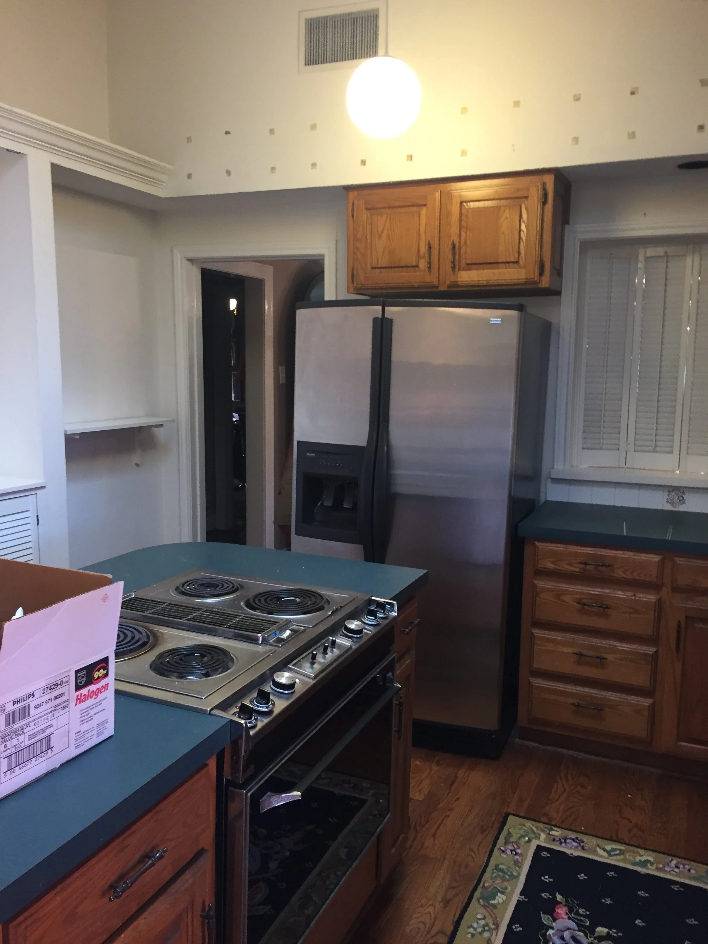
BEFORE:
Dark, closed in and inefficient!

After:
Counter space for days, personality and charm!
Photography by Andrew Slaton